


Life Is Never Just Dark: What a Painting Taught Me About Colour, Sadness and Joy


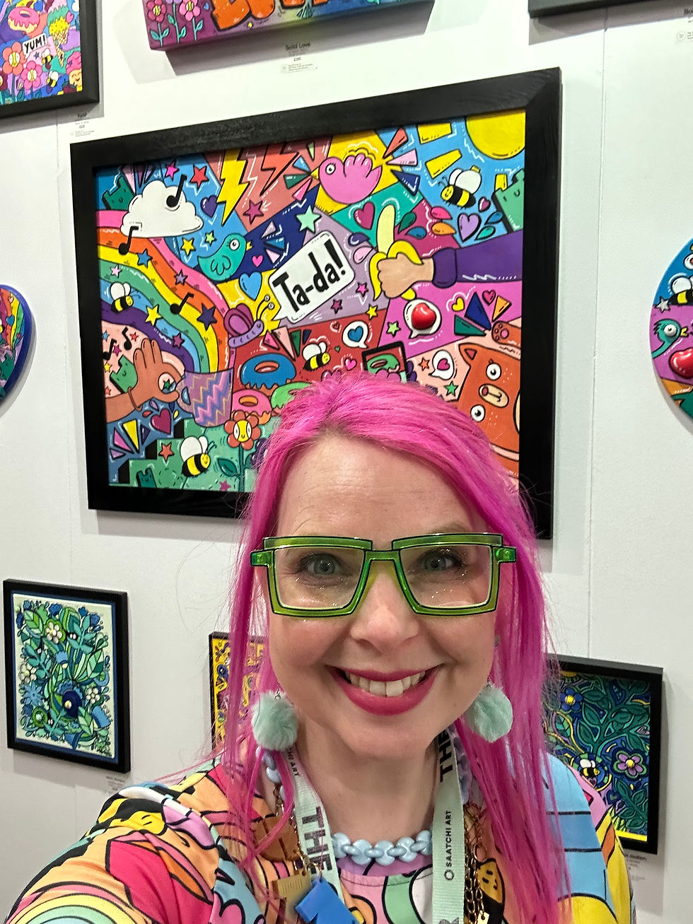
I can’t stop thinking about a painting I saw last week by the super talented artist Tim Fowler.
It wasn’t the subject matter or the composition that stayed with me, although both were beautiful. It was the colour.
The painting is full of neon pink, delicate textures, gentle strokes of spray paint and “imperfect” lines that somehow make the whole thing perfect. But around a third of the background is such a rich, deep Prussian blue that it’s nearly black.
And that’s the part I can’t stop thinking about.
If you’d shown me that colour on its own, I would have called it darkness. I would have told you it wasn’t welcome on my palette, and that it wasn’t a colour that would evoke joy for me.
If you’d asked me a week ago, I would have told you that I only use very dark colours as outlines in my cartoony-style paintings. The black makes the colours pop, gives them definition and makes the whole thing sing. But in my other paintings, I avoid dark colours almost entirely.
The reason I paint in the first place is to protect my mental health. Creativity was the thing that helped pull me out of a clinically diagnosed depression. And I think, ever since, I’ve been doing everything I can to avoid going back there.
I chase the happy. I chase the colour. I chase the joy. And there is absolutely nothing wrong with that. Finding joy in the everyday and making things that bring happiness to other people are things I value enormously. They are part of who I am and what I want my art to do in the world.
But I wonder whether, somewhere along the way, I’ve confused finding joy with avoiding sadness.
At the beginning of this year, one of our beloved cats was run over and killed. Our whole family was heartbroken.
My instinctive response was to try to make everyone feel better. To cheer everyone up. To find a way to make the sadness go away.
Thankfully, I have an amazing husband. Through his professional work, he has experience supporting people who have experienced trauma, and he encouraged us to do something I don’t think anyone had ever suggested to me at quite the right moment before.
We needed to sit with the sadness.
Not fix it. Not distract ourselves from it. Not rush towards feeling better.
Just feel it.
I found that advice surprisingly difficult, and surprisingly helpful. I knew, intellectually, that allowing ourselves to experience difficult emotions is an important part of healing. But knowing something and putting it into practice are two very different things.
I’d spent so long learning how to find my way out of depression that I wonder whether, somewhere along the way, I’d become so focused on protecting myself from that darkness returning that I’d forgotten something important: sadness is a normal part of being human.
Not every difficult feeling means something is wrong. Sometimes, we’re simply sad because life is sad. And perhaps I hadn’t really learnt how to sit with those feelings without immediately trying to find my way out.
Recently, I’ve been exploring what my artistic practice is actually about, and I’m beginning to wonder whether these things are connected.
Because the darkness in Fowler's painting isn’t simply black, is it? It’s Prussian blue. And that changes something. Classically trained artists rarely reach for a single, flat shade when they want to create something dark. They mix, layer and bring colours together to create depth and complexity. A deep blue might contain hints of purple, perhaps a little black. It shifts depending on the light and the colours surrounding it.
Life is like that, too. It’s never just dark. There is love alongside grief, tenderness alongside heartbreak, and sometimes even moments of joy in the middle of sadness.

Look at Tim Fowler’s painting. The pink is gloriously pink. The blue is deliciously blue. The colours haven’t disappeared because the background is dark. The brightness is even brighter because of the contrast.
And perhaps that’s what I’ve been missing.
When I think about my own artwork, I realise that it isn’t just the darker colours I’ve been avoiding. It’s the contrast itself.
So far, I’ve mostly painted things that make me feel happy, or that I hope will evoke joy in the people who look at them. I paint the things I love, the things that make me smile, the things that make me feel good about being alive.
But I wonder whether, in my determination to find the happy, I’ve been painting a version of life in which the happy is all there is.
There are very few perfect days. Even the happiest ones have their frustrations, disappointments and moments of sadness. We can’t be happy all the time, and that’s OK.
I don’t want to stop making joyful art. I don’t want to abandon the colour, the playfulness or the things that make my work mine. I still want to make art that makes people smile. I still want to spread joy.
But perhaps I want to explore a different kind of joy. One that doesn’t depend on everything being lovely all the time. One that acknowledges that life can be messy, painful and imperfect, and still be utterly beautiful.
I wonder whether my paintings would feel even more authentically me if they held a little more of that contradiction. If the happy things I paint existed alongside a little more of the reality of life, rather than apart from it.
I don’t know what that would look like yet. I’m not even sure it means painting different subjects. But I wonder whether allowing more of life’s complexity into my work might make the joyful elements even brighter. Whether the colour might sing a little louder, the happiness feel a little deeper, the joy a little more meaningful.
Because I don’t want less joy in my art. If anything, I wonder whether there’s a way to make that joy even more powerful by giving myself time to process the things that make life difficult, messy and imperfect, too.
Perhaps that’s what Tim Fowler’s painting has made me think about. Not that I need to paint the darkness, but that I might have been overlooking the power of contrast.
And perhaps, before I decide something is too dark to belong in my artistic practice, I should look at it a little more closely. Perhaps it’s darkness from the Prussian blue that's making the neon pink sing.

Comments